Project type
Web Portal
Client
Cricuru
Role
UX/UI Design
Time frame
4 Months
Team
Project Manager
Designer (2)
Developer (4)
Overview
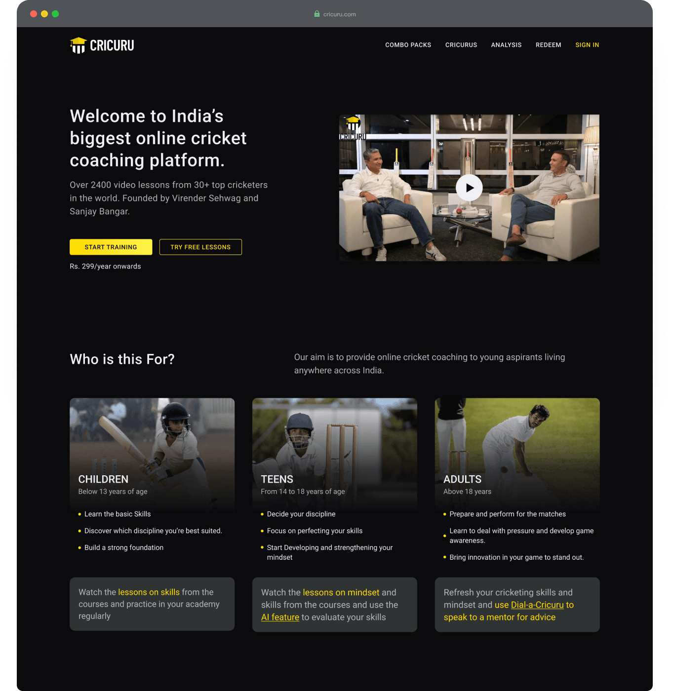
Cricuru is a web portal that aims to revolutionise ed-tech by providing curated video-based modules for young cricket enthusiasts to learn the game from 34 handpicked cricket gurus.
Our goal was to build a seamless digital experience for both web and mobile, make it easy to use and give students more control over the platform.
I was responsible for designing the web experience for the entire platform.
CONTEXT
With smartphone and internet penetration on the rise it is now easier and vital to develop an ecosystem to democratize cricket learning in India and bridge the existing gaps.
Problem
Target User
Young Aspirants
Cricket Academies
Casual Players
User Problem
Young Aspirants don't have access to a cricket academy or have to rely on local coaching centres that are not good enough because the availability of qualified coaches is pretty limited. There is also a gap in the learning curriculums, the mental aspect of the game is usually neglected and can only be taught by experienced mentors.
Business Problem
Metrics to measure success
No. of registration
Amount of sale
User Feedbacks
Discovery
Research Methods
User Interviews
Competitive analysis
Card sorting
Questions
Due to the lack of any major EdTech in the sports space, we looked at similar platform across the industries to figure out existing issues faced by the users. Interviewed aspirants and coaches from major sports academies and ran a card sorting session to figure out what and how the information is to be laid out on the platform.
The basic questions we asked were:
What is the overall journey of an aspirant?
What are their short and long term goals?
What are the aspirants and coaches thoughts on ways the game should be taught?
How is it taught currently, what are the major milestones in the whole curriculum?
How do they perceive learning the game virtually?
What hurdles users can face when learning online in the context of sports?
Findings
Key Insights
It is difficult to find academies that fits within individual overall life plans. They have to compromise between coaching expertise, location or costs.
Current scenario limits aspirant's creative capacity as it requires everyone to commit to a single program and follow the same path.
Getting feedback in a virtual setting could be difficult to achieve.
Users desire adaptability when navigating the course. They may not adhere to a set sequence, but want to proceed straight to a lesson they wish to master.
It’s essential to offer right information at right place to help user decide which course to enrol in.
Observation
A considerable proportion of individuals exhibit curiosity about the possibilities of virtual learning. Although not as a substitute of current approaches but as complimentary space where they can independently learn, grow and experiment by themselves.
Solution
Objectives
Intuitive user flow
Help in decision making
Maintain familiarity
Cater to the user needs
Design
Based on the user insights we developed an intuitive user flow. We focused on simplicity, aligning with existing user habits. In the initial phase, the main goal was designing an Information Architecture that accommodates all potential use-cases and a design strategy that addresses both user and business objectives.
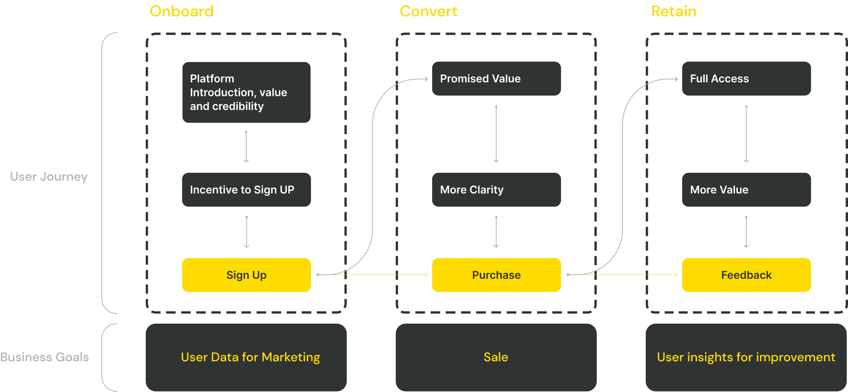
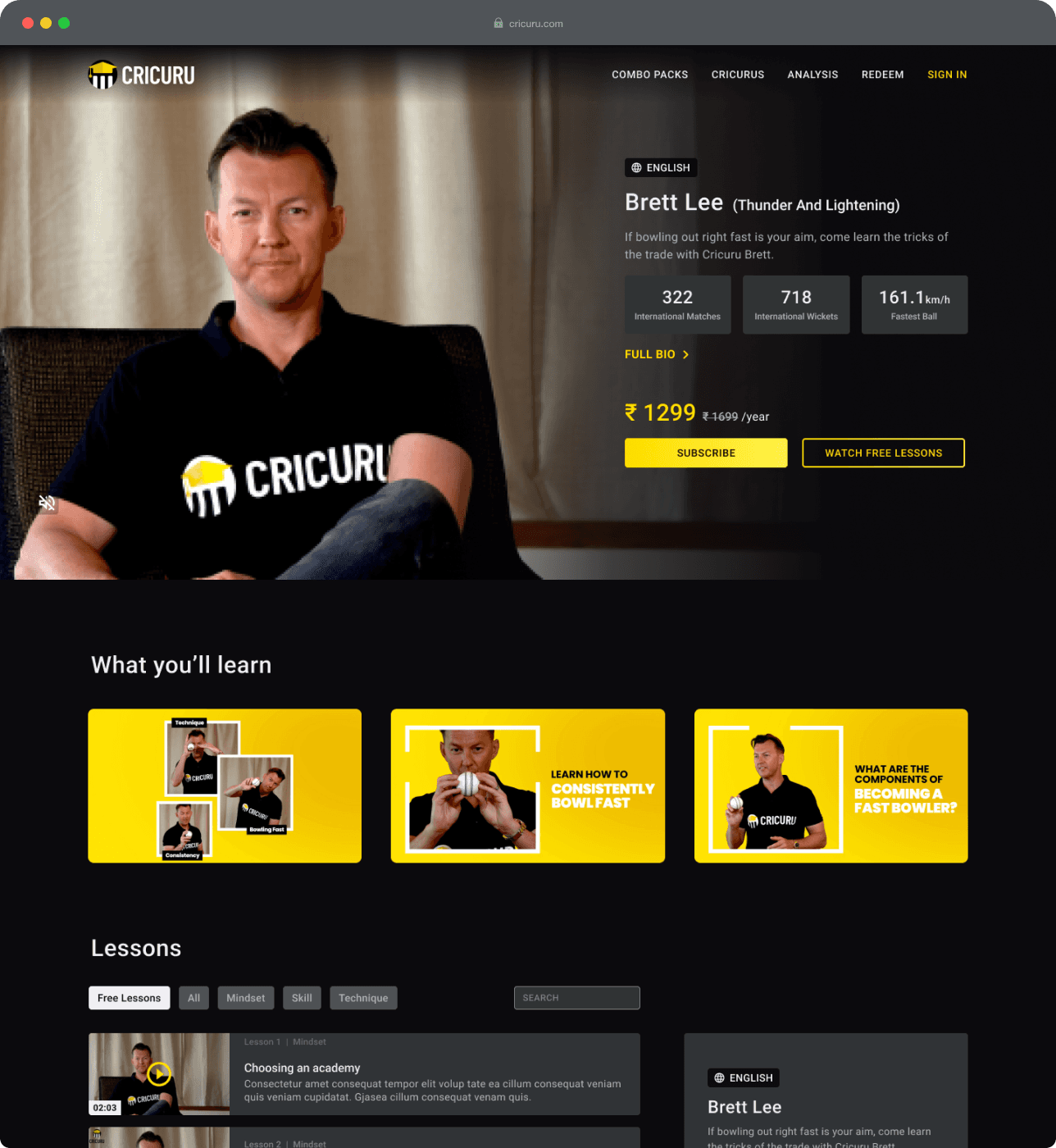
Introducing Product - Onboard
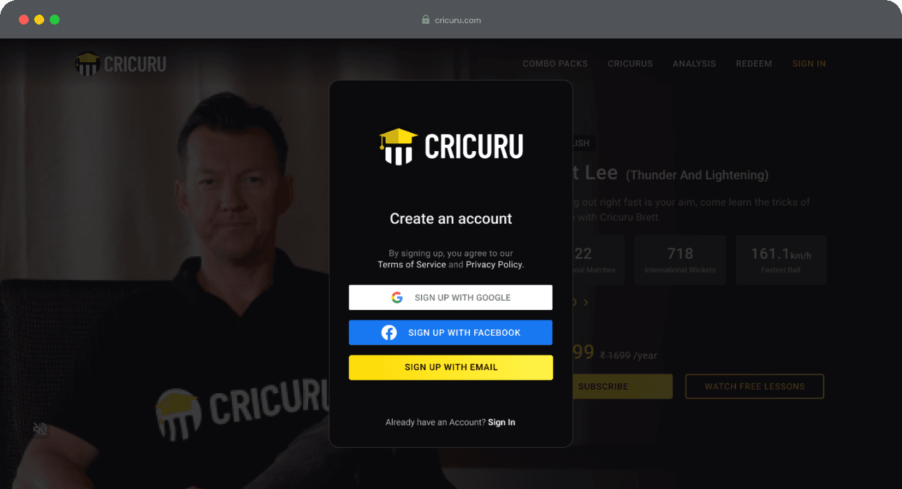
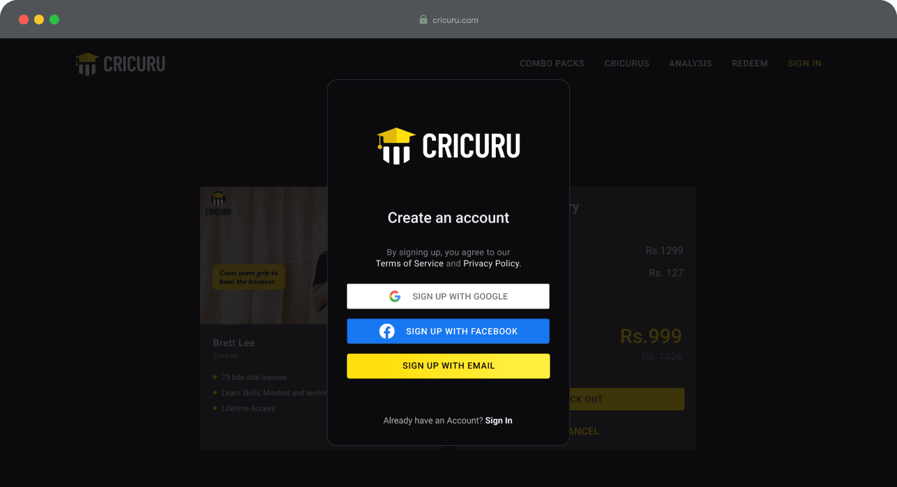
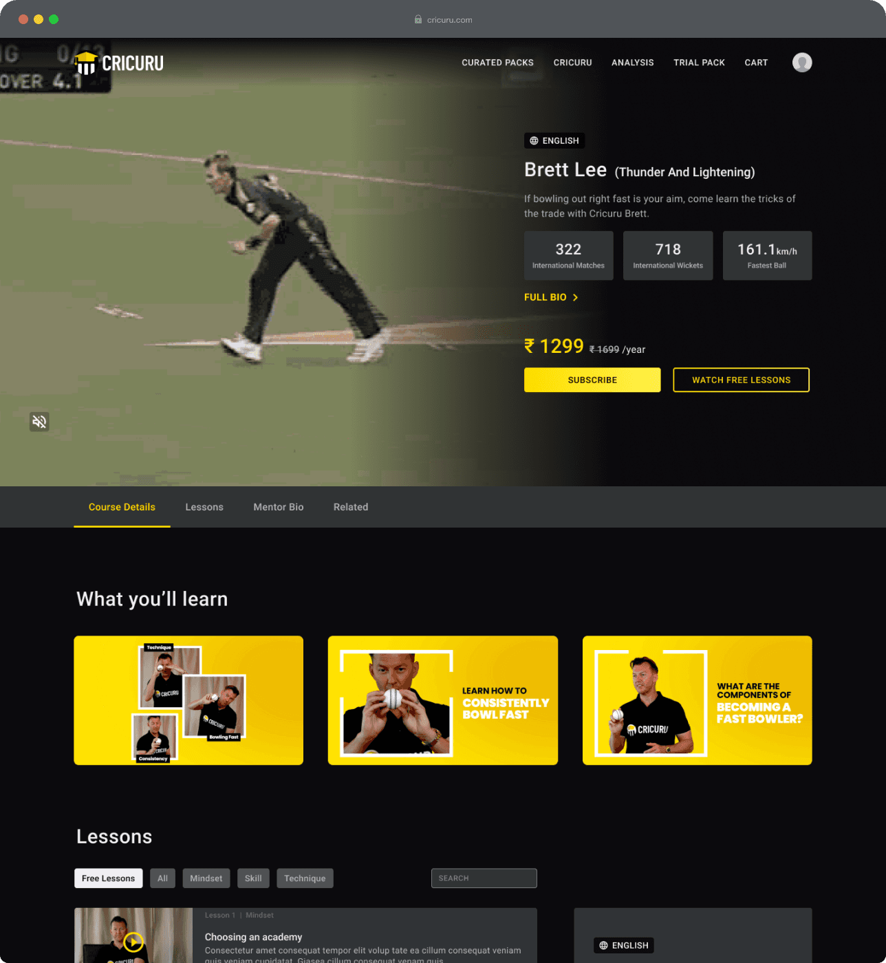
Before users subscribe to a course it is important for him to understand the product and services and what is in it for him. At this point, if they are convinced, they should be able to directly subscribe to a course. If they aren't, they should move one step forward towards the desired goal by signing up.
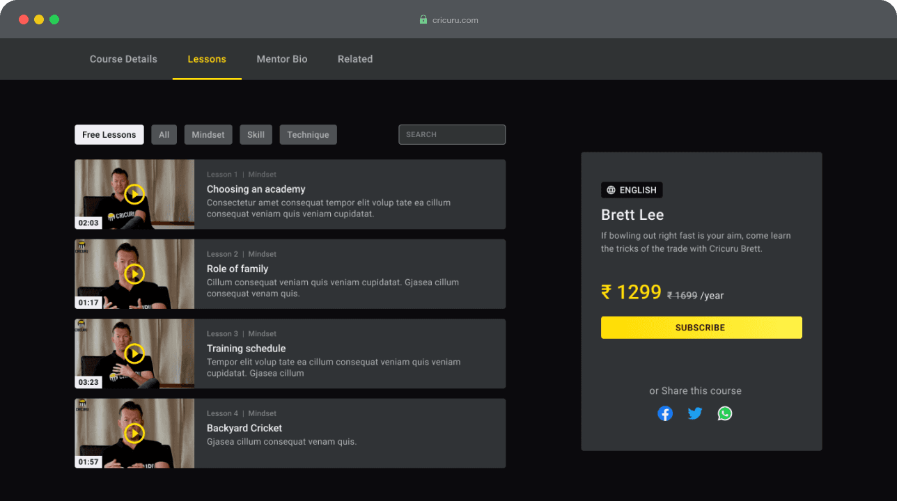
Users receive comprehensive information addressing any queries they may have about the product.
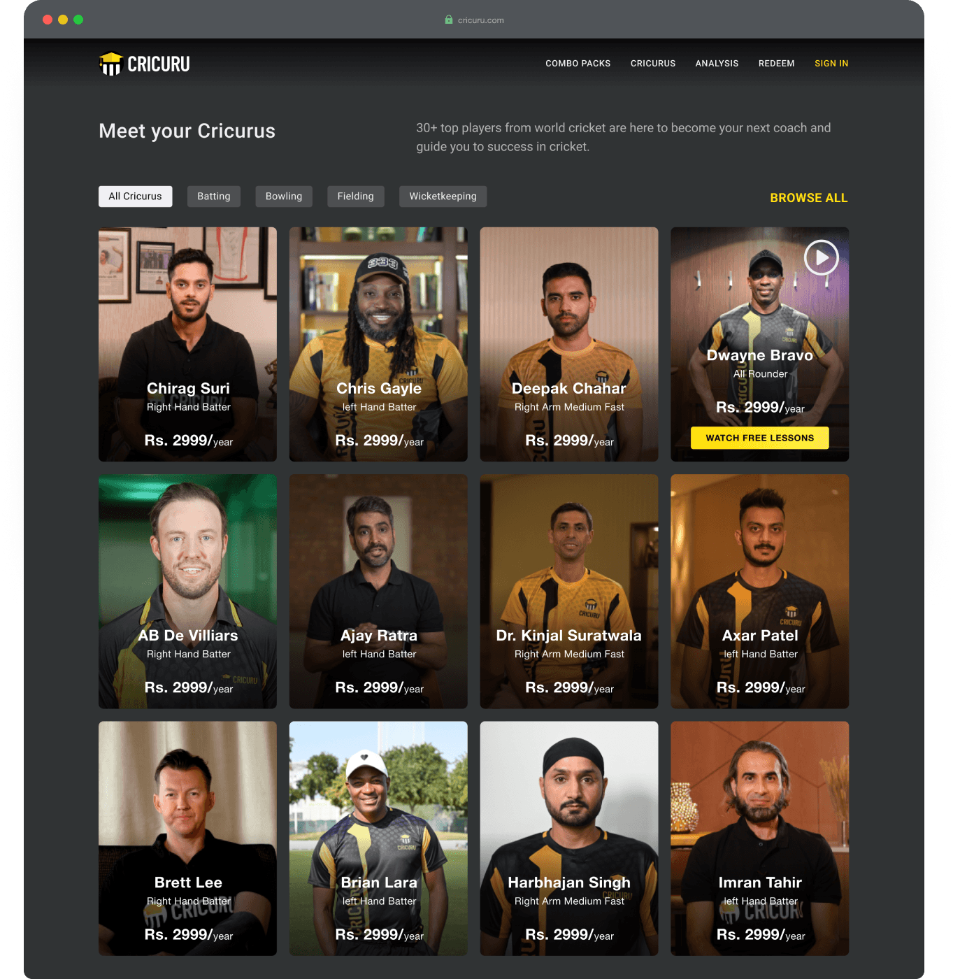
They can browse available mentors and their course.

Users possess the choice to instantly subscribe to a course or view free lessons.
Free lessons can only be accessed after sign up and act as a incentive to take this action.
Upon registration, individuals gain access to the free lessons. This benefit can encourage them to ultimately subscribe to the course.
In case a visitor is convinced and recognise the benefits, they may proceed to directly subscribe the course and swiftly sign up along the way through a streamlined procedure.
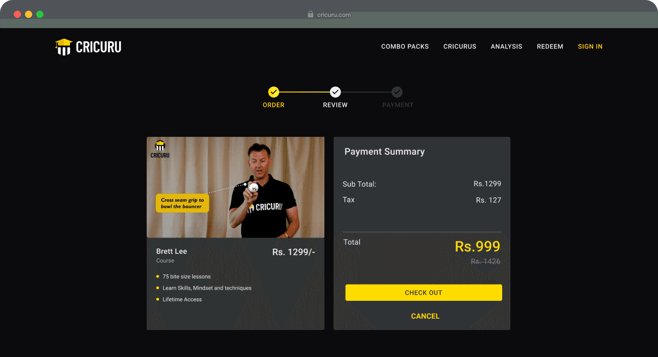
While reviewing the order, the benefits are reiterated and emphasised to help them continue and complete the process.
Users register as a step in the journey.
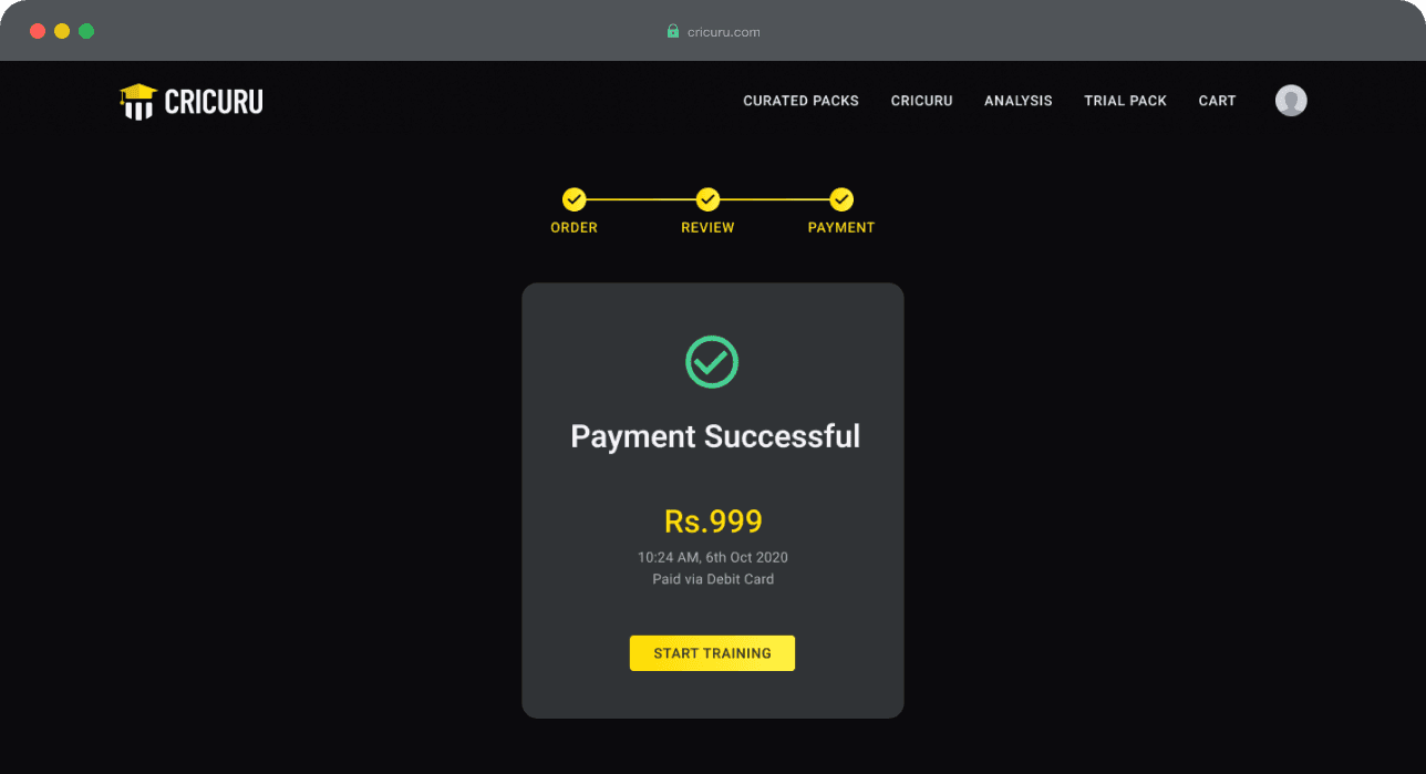
Once the payment is done, the subsequent step is highlighted to prevent users from feeling disoriented and ensuring they understand their position.
Gets full Access to the course
Post Sign Up - Conversion
Once a user registers, it's clear they're intrigued. Consequently, we provide complimentary lessons as a sample of our content, further motivating them to buy a course.
Users should also be able to subscribe to various courses from their preferred mentors. However, repeating this process for every course would be exhausting for users and detrimental to conversions. As a result, we introduced a shopping cart system. When a user subscribes to a course, it's added to their cart, allowing them to add multiple courses and complete the purchase in a single transaction.
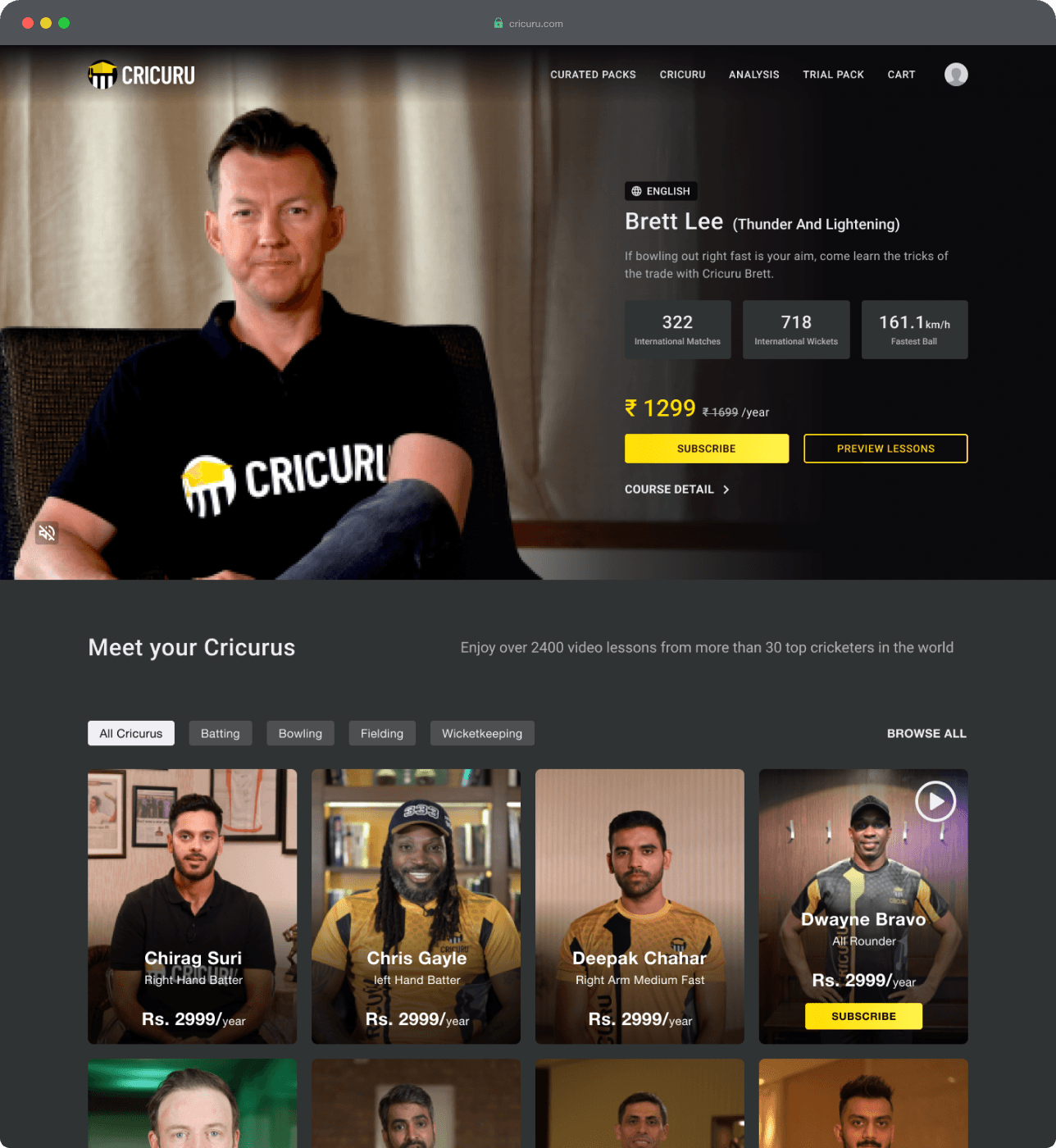
Homepage now emphasises courses, while other details remain accessible but not prioritised.
On the course page, complimentary lessons can be found to encourage users to enroll in the course while continuing to highlight the advantages.
A persistent panel holds the primary CTA, ensuring effortless availability when the user is prepared.

Once the subscribe button is pressed, the cart panel reveals, letting users know they can subscribe to multiple courses at the same time.
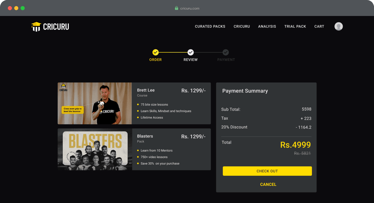
While reviewing the order user can see the benefits of each items to help them to take the next step.
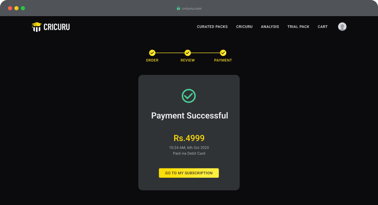
Once the payment is done, the subsequent step is highlighted to prevent users from feeling disoriented and ensuring they understand their position.
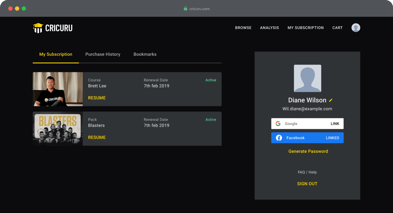
Customers can access all their subscriptions from their accounts, including essential details such as bookmarks and transaction history.
Post Purchase - Retain
Following a purchase, it's essential to ensure an optimal product experience, prompting users to renew their subscriptions and maintain their platform presence.
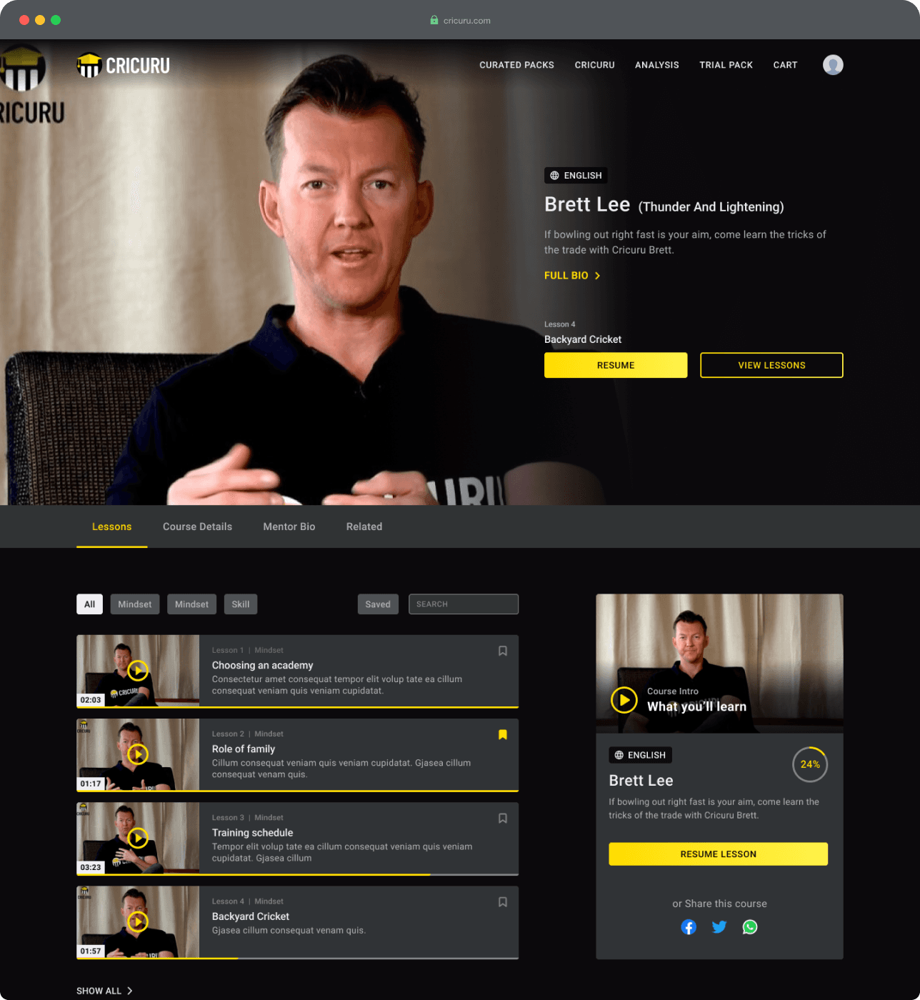
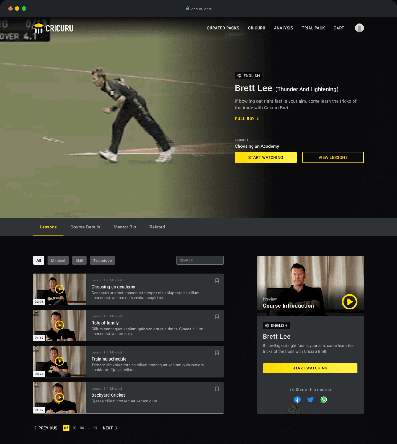
Users can resume from where they left off from the first fold itself. A sticky tab bar give easy access to all the details about the course.
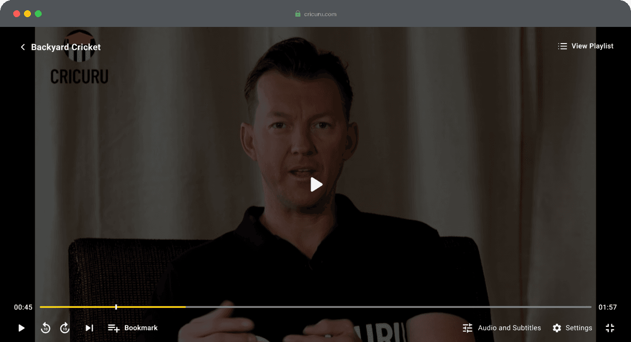
Default fullscreen mode for focused, uninterrupted watching
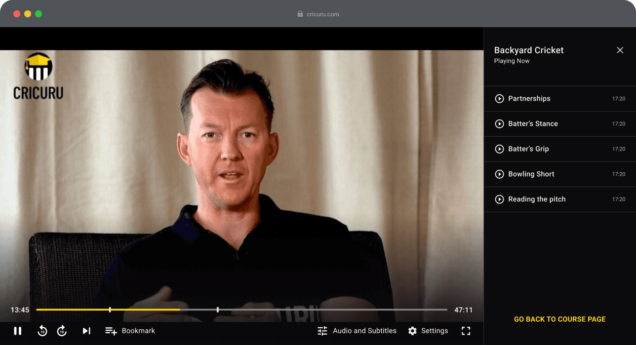
Easy access to full playlist and ability to bookmark the course
BUSINESS IMPACT